Interviews — 5 Min Read
Laura De Alexandris, interview for Mancini Enterprise
Interviews — 5 Min Read
A project for a Service company in Electronic Production field
Today we speak with Laura De Alexandris, the illustrator and graphic artist who was responsible for the renewal of the Mancini Enterprise Group’s corporate image. Laura does a very challenging and unexpectedly complex job. I am surprised by the way she has managed to integrate such a creative job as illustration into a very technical field such as the industrial electronics sector.
- How was this project born?
In July 2021, Mancini Enterprise Group contacted me and offered me to renew their corporate image. I had not yet worked for the industrial electronics sector. Initially, I thought it would be difficult for me to interface with a purely technical sector, but when I met Luigi Mancini, engineer and founder, and his son Alberto, I immediately understood that there was a lot of room for dialogue and above all for inventiveness.
- So there was an immediate understanding between you …
It might make you smile but I believe that engineers and artists are similar professionals, they always have to make an extra effort to make themselves understood by others. Thus, the project benefits from a sort of mutual understanding and recognition.
- What goals did you have to achieve?
Luigi and Alberto expressed the desire to differentiate themselves from their competitors. I agreed that the communication had to be original, unconventional and include technical references for the sector.
The work I was about to do had to express the company’s values (efficiency, competence and flexibility) in a simple and understandable way and attract the consumer in a way that was unprecedented compared to the standard of the industrial electronic sector. I would also have dealt with the corporate image identity. These are documents that a company needs to present itself to customers (business cards, letterheads, presentation formats, etc.)
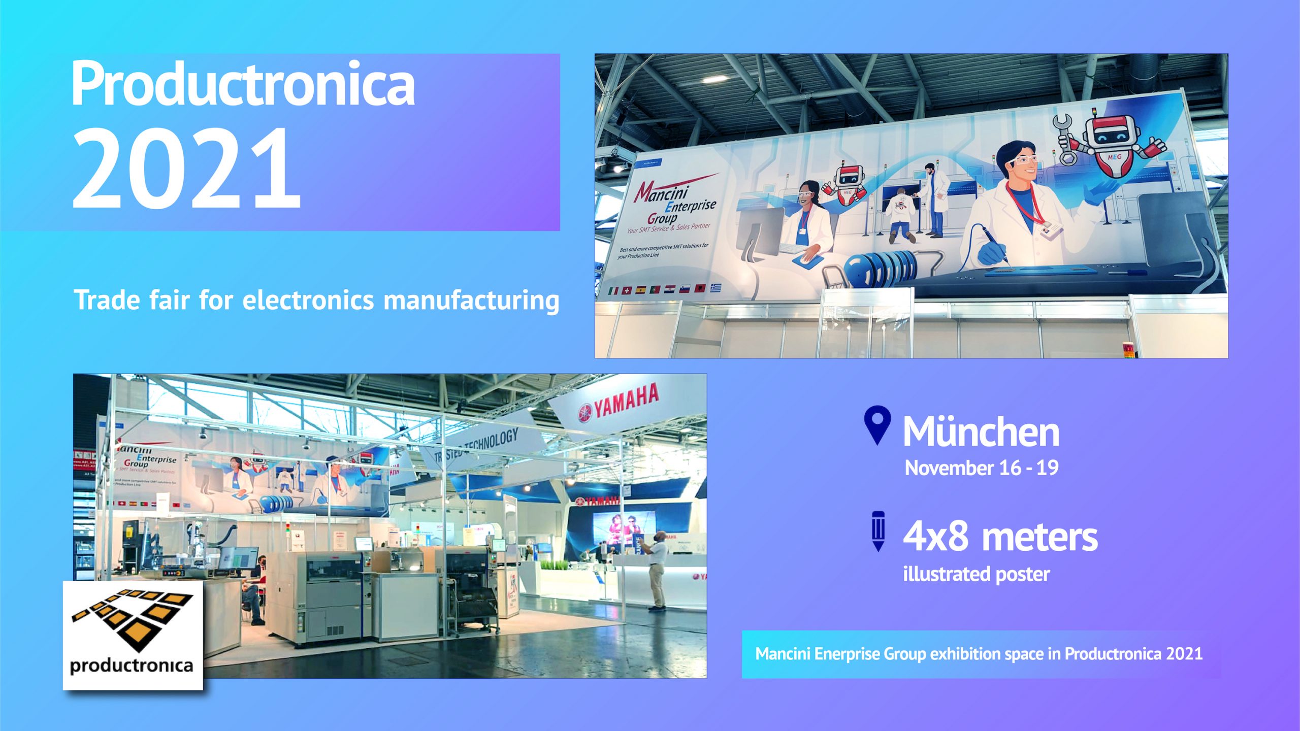
Subsequently I would have designed a 4 x 8 meter poster to set up their exhibition space in Productronica 2021, one of the most important technology fairs in the sector that takes place in Munich every two years.
Going further in the interview…
- Wow, I understand that the objectives were many …
Yes, however it’s a job that I have always felt mine. You can almost never get bored, there is always something new to learn and ideas to develop. You also risk a lot of frustration because you work with “what does not yet exist”, it means working with the possibility and not having a manual that explains how to achieve that precise result, in fact it is not taken for granted that a project will materialize effectively. Knowing how to integrate knowledge, semiotics, history, culture, imagination, emotions, economic-environmental and technical resources is the recipe for being effective, seductive and authentic in communication.
- Based on the last considerations, How did you structure the communication?
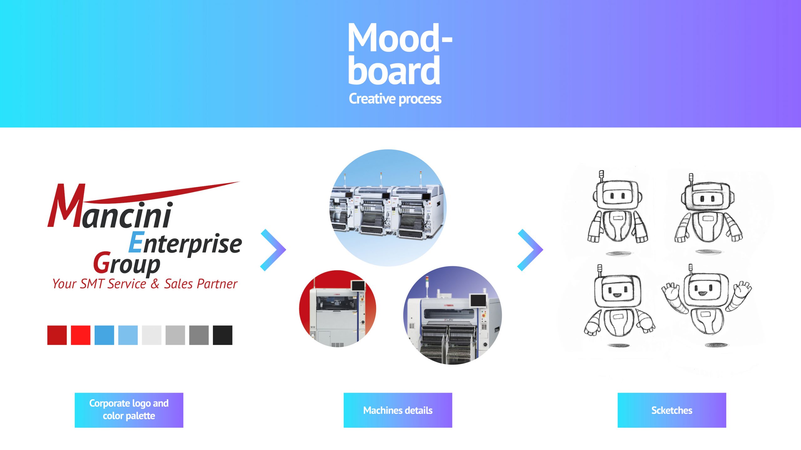
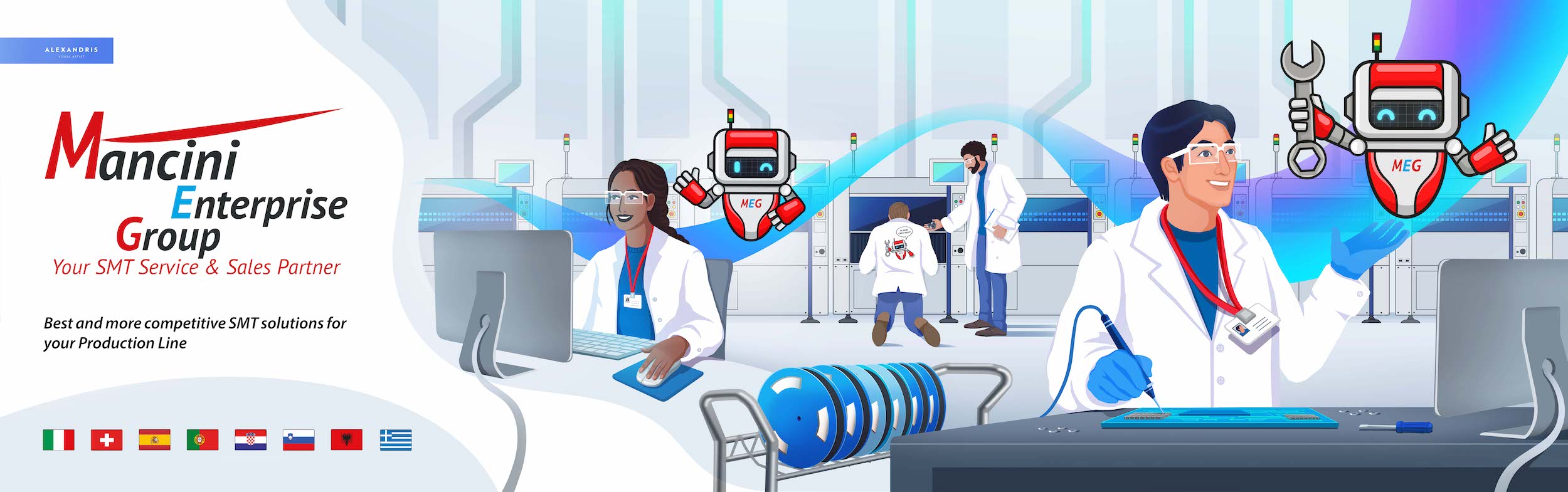
I initially considered the history of the company, the service they offer and how their competitors communicate. Mancini Enterprise is a company mainly supplied with Japanese technology. In Japan, a strategy that is used extensively is to have a corporate mascot that conveys trust and trustworthiness. It is a strategy that tends to gamble here in Italy, where professionalism tends to be at the fore when thinking about a logo or image associated with the business. I have nothing to take away from professionalism but when everyone wants to pursue the same workhorse, including you, there is not much room to differentiate and stand out from the others. I later realized that a mascot was the best choice to make. I thought that associating a pleasant and accessible image with a useful but still industrial and cold technology was the key to effective and fun communication. The intention was to give the buyer a playful presence, able to remain in the memory and lighten the technical information that he/she assimilates every day.
- What mascot did you create for the Mancini Enterprise?
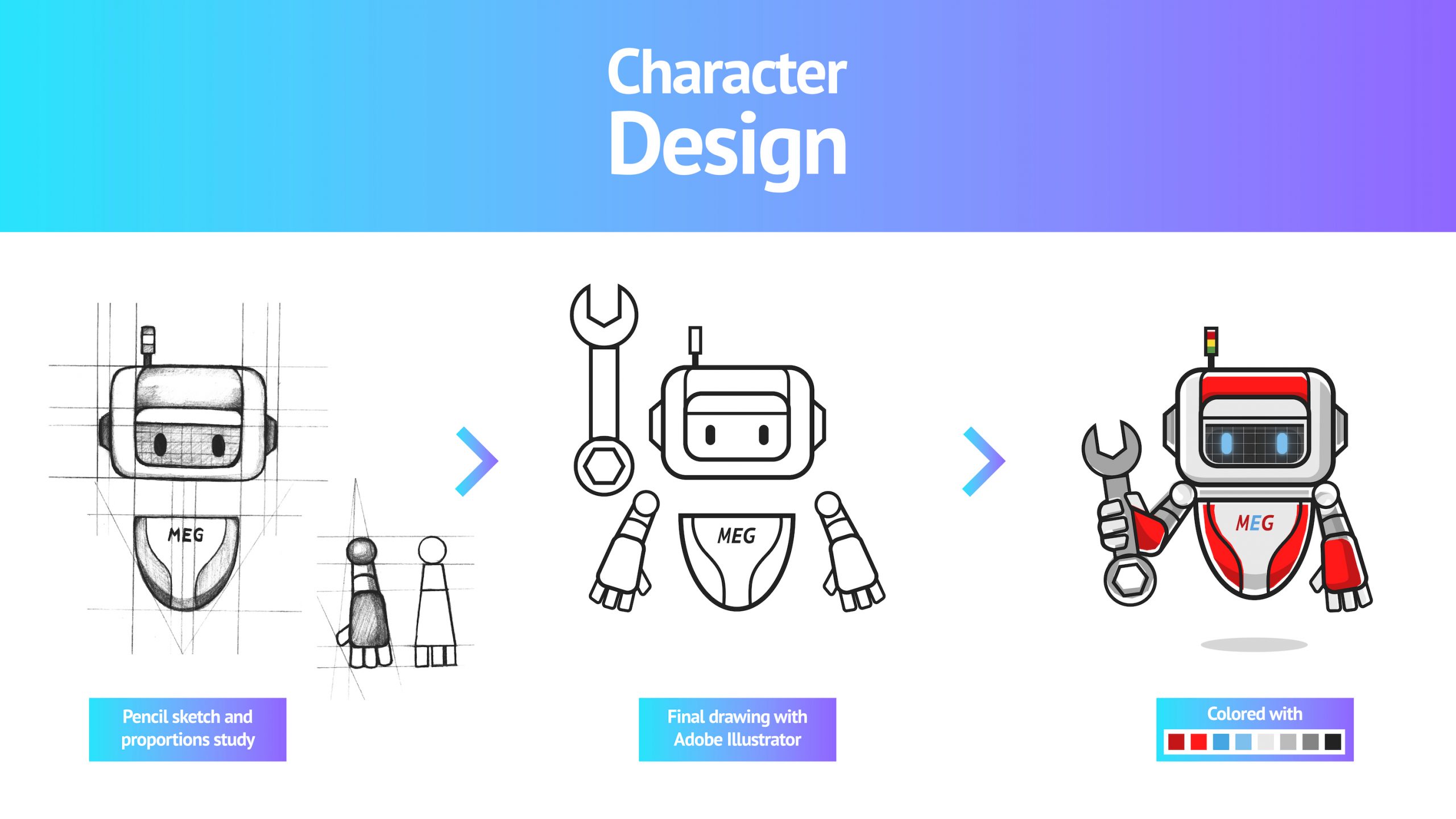
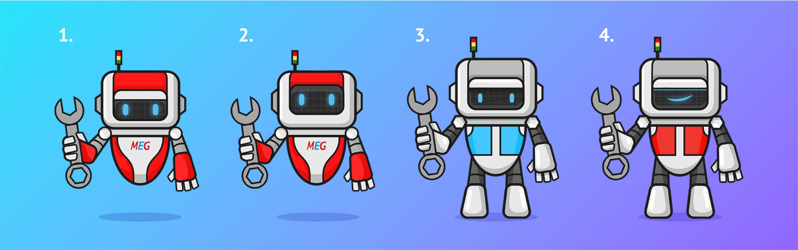
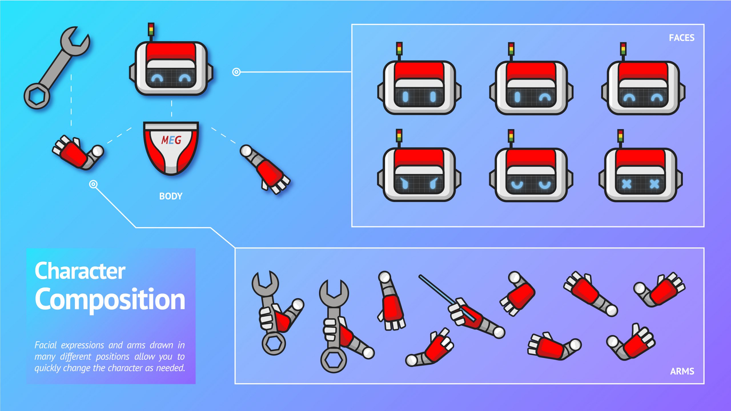
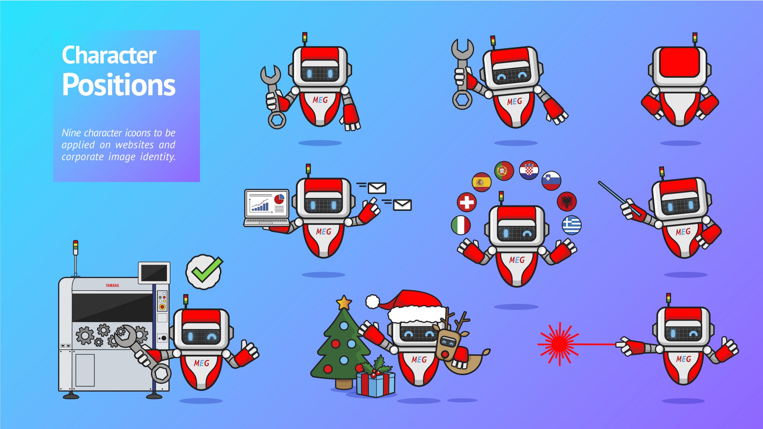
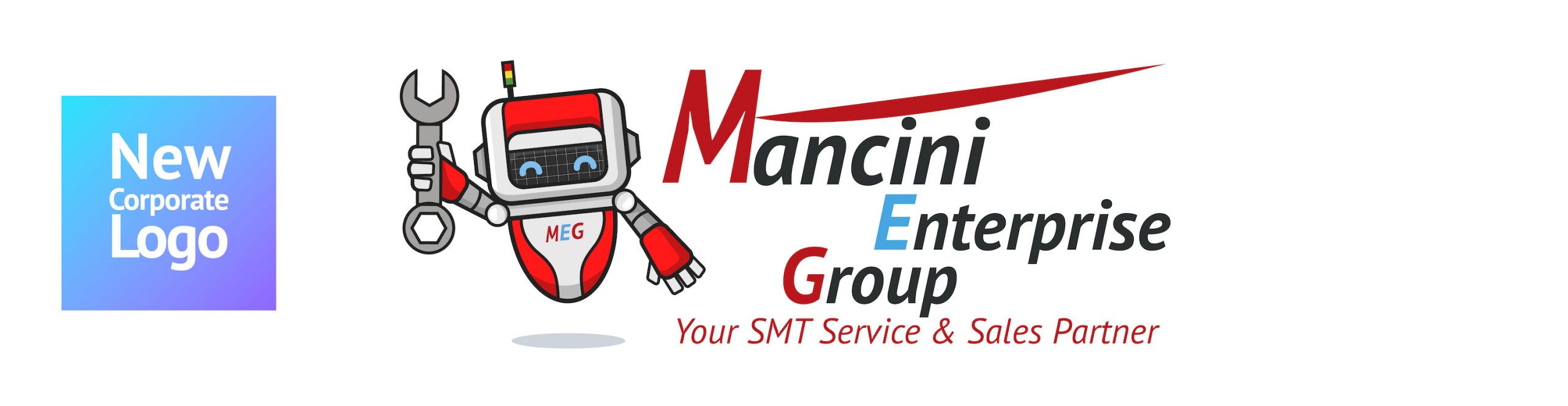
II invented M.E.G., the acronym of Mancini Enterprise Group. M.E.G. is a robot capable of selling, repairing and assisting the customer. I did an iconographic research before creating it and discovered that paradoxically the manufacturers of machinery with SMT technology (Surface Mount Technology) used scarce graphic references to automation. The iconography of the robot was used instead to support web services and online assistance. I considered the situation, M.E.G. could really have been an unprecedented image for the sector. I chose the company’s colors to provide four graphic proposals to Mancini Enterprise.
- What inspired you to create M.E.G.?
I was inspired by the shape of the pick & place machines that the company sells. A reliable but generic looking robot would not have made communication effective. The mascot had to personify the activity and personality of those who work in the Mancini Enterprise.
- How was the final version agreed?
Luigi and Alberto Mancini chose the first version. The idea of making M.E.G. similar to the pick & place machines was a winner. They were pleasantly drawn to the robot’s red frame and its unique, friendly and energetic appearance. One of the strengths of my work is to be able to create something exclusive for other people, something that also allows you to solve a problem: how to remain authentic despite the market demands to appear.
- And the poster for the fair?
For the Productronica 2021 fair, I thought of an illustration that depicted an SMT production line. I did a thorough research before making it. I needed photos of the work environments, workers, machinery and tools used. I chose to represent a youthful, international and collaborative environment, an environment in which M.E.G. could operate by helping the technicians and therefore show potential customers what kind of service the Mancini Enterprise Group offered.
- The poster was huge, how did you go about making it?
Fortunately we live in the digital age, the poster was 4 x 8 meters large, I was able to work in scale on Adobe Photoshop and Illustrator. The printer in Germany took care of printing it on canvas at actual size and then the exhibition fitters mounted it on the stand.
- How was the renewal of the corporate image welcomed during the fair? Did the competition chose a strategy similar to yours?
Luigi and Alberto Mancini told me that it was a great success. I felt honored to be able to bring my work to Munich and know that people in the industry felt represented by my illustration. Combining art and industrial electronics is possible, unusual but pleasant and engaging for the observer. We have differentiated ourselves from the competition, no one has thought of acting with a strategy similar to ours. We had a little less budget than the major electronics brands present at the fair, however we collaborated and were able to fully exploit our economic resources to obtain general recognition and new customers.
What do you think you have learned from this experience?
One of my nightmares is having to blindly adhere to a convention. Doing something because everyone does it does not guarantee that something is right or smart. I think I have learned to be more daring, because breaking out of conventions and being recognized for doing so is a truly constructive experience. It reminds me of who I chose to be: an artist.